Identity Branding Agency

The Essential Guide to Brand Identity Design: Creating a Lasting Impression with Digital Branding Agency

Introduction

In the bustling marketplace where businesses clamor for attention, a strong brand identity serves as a beacon that calls customers home. It’s more than just a logo or tagline—it’s the sum total of your company’s values, personality, and promise to consumers. A powerful brand identity distinguishes your business, fosters customer loyalty, and ultimately drives growth. But how do you create a compelling brand identity? And what role can design agencies play in this process? Let’s explore.

Guide to Creating Identity Design Services

Creating a brand identity is like piecing together a puzzle. Each element plays a critical role in presenting a cohesive image that resonates with your target audience. Here’s a step-by-step guide to help you navigate this process.

Research and Define Your Visual Identity

Understanding who you are as a brand is the first step in creating a meaningful brand identity. Conduct thorough research on your market, competitors, and target audience. Use these insights to define your brand’s mission, values, and unique selling proposition (USP).

Design Your Logo and Visual Elements

Your logo is the face of your brand—make it memorable. Work with skilled designers to create a logo that reflects your brand’s essence. Also, develop other visual elements like color schemes, typography, and imagery that align with your unique brand personality.

Craft Your Brand Messaging

Your brand messaging communicates your values and promises to consumers. This includes your tagline, product descriptions, social media content, and more. Effective messaging speaks directly to your target audience and motivates them to engage with your brand.

Create Consistent Branding Across Channels

Whether it’s your website, social media platforms, or physical stores, ensure your branding is consistent. Consumers should have a seamless experience interacting with your brand, regardless of the touchpoint.

The Role of Design Agencies in Brand Identity Creation

Design agencies bring a wealth of expertise and experience of brand development , making them invaluable partners in brand identity creation. They offer a fresh perspective, creative talent, and proven strategies to build a brand identity that resonates with your audience. Moreover, design agencies foster a collaborative process, working closely with you to bring your brand vision to life.

Case Studies of Successful Brand Identities

Inspiration often strikes when we look at successful brands. Let’s explore some notable examples:

1. Apple:

Apple’s brand identity centers on simplicity, innovation, and elegance. Its minimalist logo, sleek product design, and consistent messaging across all platforms embody these values.

2. Nike:

Nike’s iconic “swoosh” logo and “Just Do It” tagline encapsulate the brand’s adventurous, ambitious spirit. Nike consistently uses powerful imagery and motivational messaging to engage its target audience.

These cases illustrate the power of a well-crafted brand identity. It’s not just about visual elements, but also the underlying values and emotions they evoke.

Common Mistakes to Avoid in Brand Identity Design

Creating a strong brand identity is not without pitfalls. Here are some common mistakes to avoid:

1. Lack of Research and Understanding:

Skipping the research phase can result in a brand identity that doesn’t align with your audience’s preferences or market trends.

2. Inconsistency in Branding:

Inconsistent branding confuses customers and weakens brand recognition. Stick to your brand guidelines across all platforms and touchpoints.

3. Ignoring Target Audience and Market Trends:

Your brand identity should cater to your target audience’s tastes and the current market trends. Ignoring these can make your brand seem out of touch.

Advoice Inc. best branding company in Ahmedabad

Advoice Inc. is renowned as the leading branding agency in Ahmedabad for its innovative approach to creating impactful brand identities. With a team of experienced professionals, Advoice Inc. has successfully helped numerous branding solutions establish a strong and memorable brand presence in the market. The agency understands the importance of a well-crafted brand style and works closely with its clients to develop strategies that resonate with their target audience. From logo design and brand messaging to digital marketing and customer engagement, Advoice Inc. offers a comprehensive range of branding services tailored to meet the unique needs of each client. The agency’s track record of delivering exceptional results has earned it a reputation as the go-to branding agency in Ahmedabad. Whether it’s a startup looking to make a mark in the industry or an established business seeking to revamp its brand, Advoice Inc. has the expertise and creativity to help businesses stand out and succeed in the competitive market. 

Conclusion

Building a compelling brand identity is a strategic and creative endeavor. It demands deep understanding, meticulous planning, and consistent execution. It’s an ongoing process of aligning your brand with your business objectives and audience’s expectations.

Remember, your brand identity is not just about aesthetics—it’s about creating a lasting impression, a signature presence in the hearts and minds of your consumers. If you need guidance or expert assistance in creating or refining your brand identity, don’t hesitate to contact us. Our team of design professionals is ready to help bring your brand to life.

Our branding agency offers a wide range of services including logo design, brand strategy, creative branding, brand positioning, brand design, branding services, digital marketing, and more.

Brand strategy is crucial for a business as it sets the direction for the brand, defines its positioning in the market, and outlines the long-term plan for building a successful brand.

Our agency stands out as a creative branding agency due to our innovative approach, unique brand designs, and the ability to create a distinct brand identity for our clients.

Effective brand positioning involves identifying the target audience, understanding their needs, distinguishing the brand from competitors, and creating a compelling brand image that resonates with the audience.

Branding agencies can help with digital marketing by creating cohesive brand messaging across various digital platforms, designing engaging visual content, and implementing effective digital marketing strategies to enhance brand visibility and engagement.

Brand guidelines play a crucial role in maintaining brand consistency and integrity. They provide clear instructions on how to use brand elements, ensuring that the brand identity is represented accurately across all communications and touchpoints

Investing in professional brand design services is essential as it helps in creating a strong brand identity, building brand recognition, and differentiating the brand from competitors, ultimately leading to enhanced brand value and customer loyalty.

Having a new brand design can revitalize a business, attract new customers, differentiate the business from competitors, and reflect any changes in the business offerings or positioning, ultimately leading to increased brand relevance and appeal.

A branding agency can help in social media branding by developing a cohesive brand image and messaging for social media platforms, creating visually appealing content, and implementing effective social media branding strategies to engage the target audience.

The key components of a successful branding process include brand research, brand strategy development, brand identity design, brand messaging creation, brand implementation, and ongoing brand management and assessment.

Real Estate Pamphlet Design

Revolutionizing Real Estate Brochure Pamphlet Design: The Art of Designing Stunning Brochures By Designer

Introduction

Unlock the potential of real estate marketing with our comprehensive guide on creating captivating brochures. In this article, we delve into the world of brochure design, exploring the nuances of real estate pamphlet design, designs, and the impact they have on property marketing. Discover why investing time in designing a visually appealing and professionally crafted brochure can make all the difference in showcasing your properties and attracting potential clients.

Why Read This Article?

In an era where first impressions matter, a well-designed real estate brochure can be the game-changer in marketing your properties. This article is your go-to resource for understanding the significance of brochure design, unlocking the power of templates, and mastering the art of customization. Whether you’re a real estate professional or an aspiring designer, the insights shared here will empower you to create brochures that not only impress but also generate leads and elevate your marketing efforts to new heights.

Brochures: The Cornerstone of Real Estate Brochure Design

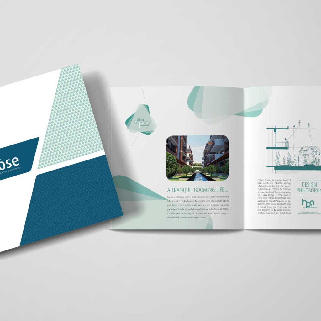
Brochures are the cornerstone of real estate brochure designBrochures are the cornerstone of real estate brochure design to potential buyers. A well-designed brochure can make a lasting impression and provide valuable information about a property, such as features, layout, and location. It can also effectively market the real estate agent or agency, highlighting their expertise and successful track record. With attractive imagery, compelling content, and a professional layout, brochures can engage and captivate potential buyers, ultimately leading to successful sales and satisfying both sellers and buyers in the real estate market. 

What Makes Brochures Essential in Property Promotion

Brochures are essential in property promotion for several reasons. Firstly, they provide detailed information about the property, including its features, amenities, and location. This allows potential buyers or renters to have a clearer understanding of what the property has to offer. Secondly, brochures serve as a tangible and portable marketing tool that can be easily distributed at open houses, community events, or through direct mail. They also provide a professional and visually appealing representation of the property, helping to attract attention and generate interest. Additionally, brochures can be used as a reference for potential clients to keep and review at their convenience. Overall, brochures play a crucial role in effectively promoting properties by providing comprehensive information, engaging visual appeal, and convenient accessibility for potential buyers or renters. 

Understanding the Impact of a Well-Designed Brochure

A well-designed brochure goes beyond mere aesthetics; it communicates professionalism and attention to detail. A carefully crafted layout, compelling visuals, and engaging content not only attract but also retain the viewer’s attention. The impact of a well-designed brochure extends to brand perception, positioning your properties as desirable and elevating your overall marketing strategy.

Customizing Templates for a Unique Brand Identity

While templates provide a convenient starting point, customization is where your brand’s personality shines through. Tailor templates to align with your brand’s color scheme, typography, and overall aesthetic. This customization not only enhances brand identity but also ensures that each brochure is a unique reflection of your properties.

The Role of Visual Elements in Brochure Design

Visual elements play a crucial role in brochure design, as they are often the first thing that captures the viewer’s attention. Strong visuals can convey the message of the brochure quickly and effectively, drawing the reader in and encouraging them to explore the content further. Images, colors, and typography all work together to create a cohesive and visually appealing design that enhances the overall message. Visuals also help to establish the tone and personality of the brand, making a lasting impression on the audience. By carefully selecting and arranging visual elements, designers can create a brochure that is both eye-catching and informative, leaving a lasting impact on the reader. 

Choosing Layouts that Highlight Property Listings

The layout of your brochure plays a pivotal role in guiding the viewer’s attention. Strategically organize property listings, ensuring that each listing receives the attention it deserves. Use grids, columns, and sections to create a visually pleasing and easy-to-navigate layout that encourages potential clients to explore further.

Differentiate free templates and customized pamphlet

Free templates for pamphlets are pre-designed layouts that can be easily edited to add your own text and images. They are a great option for businesses or individuals who want a quick and affordable solution for creating pamphlets. On the other hand, customized pamphlets are tailor-made to fit the specific needs and branding of a company or individual. They allow for complete creative control over the design, layout, and content. While free templates are convenient and cost-effective, customized pamphlets offer a unique and personalized touch that can make a significant impact on the target audience. 

Best real estate pamphlet design company in Ahmedabad

AdVoice Inc. is the premier real estate pamphlet design company in Ahmedabad. With a team of creative and experienced graphic designers, we specialize in creating eye-catching and customizable pamphlet designs that effectively showcase your properties. Our professional real estate brochure designs are tailored to highlight the unique selling points of each property, ensuring that potential buyers are immediately captivated.

Our attention to detail and commitment to delivering high-quality designs sets us apart as the best in the industry. Whether you are a real estate agent, developer, or property manager, AdVoice Inc. has the expertise to create professionally designed pamphlets that will attract and engage your target audience. Trust us to elevate your real estate marketing efforts and leave a lasting impression. 

Conclusions:

In conclusion, the art of designing stunning real estate brochures goes beyond aesthetics—it’s about creating a narrative that resonates with potential clients. As a designer, your role in revolutionizing real estate brochure pamphlet design is pivotal. By balancing style and substance, leveraging professional photography, and exploring the versatility of templates, you elevate the impact of every brochure. Remember, customization is the key to not only meeting but exceeding client expectations. As you embark on this creative journey, envision each brochure as a work of art that not only showcases properties but tells a compelling story. Through your expertise, you have the power to transform a mere pamphlet into a marketing masterpiece, leaving a lasting impression on both clients and the real estate industry at large. Embrace the potential of your designs, and let them stand as a testament to the innovation and artistry that defines your role in revolutionizing real estate brochure design.

A professional real estate brochure is a marketing material used to showcase properties, provide property details, and promote real estate services. It typically includes images, property details, and contact information in a visually appealing layout.

You can design a real estate brochure using a variety of templates available online or by hiring a professional designer. There are many real estate brochure design templates that you can customize to fit your needs and brand.

Real estate brochure templates are available on various online platforms that cater to different design needs. You can find them on graphic design websites, template marketplaces, or through professional design software.

A real estate brochure should include property details such as photos, descriptions, and specifications, as well as contact information, a company logo, and any relevant branding or design elements to make it visually appealing.

Most real estate brochure templates are editable, allowing you to add your own content, adjust design elements, and tailor the brochure to fit your specific property or real estate marketing needs.

Yes, there are real estate brochure design templates specifically tailored for luxury properties. These templates often include high-end design elements and layouts to make your brochure look sophisticated and upscale.

Yes, there are free real estate brochure templates available online. You can find a wide range of options that cater to different styles and property types, allowing you to save time and marketing costs.

A well-designed real estate brochure can serve as a powerful marketing tool by providing potential buyers with comprehensive property information, creating a professional and credible impression, and effectively showcasing the property’s unique selling points.

Real estate brochures are commonly available in standard sizes such as A4 and A5. These sizes offer ample space to include property details, images, and contact information while still being easy to distribute and handle.

Yes, real estate brochure templates can be used for digital marketing efforts by converting them into digital formats such as PDFs or images for online distribution, email campaigns, and social media promotion.

Cooking Logo

Every Recipe is a Dash of Nostalgia: Craft cooking logo image from a Logo Designer

Introduction

Welcome to the world where the sizzle of a pan meets the stroke of a brush—cooking logo design. In this exploration, we’ll dive into the details of creating a visual identity that captures the essence of culinary delight. As someone passionate about both cooking and design, I’m excited to guide you through the intricate artistry that goes into crafting a cooking logo that speaks volumes.

Crafting the Perfect Cooking Logo Illustration: A Detailed Guide

Cooking Logo Essentials: Beyond the Basics

Let’s start by understanding the fundamental elements of a cooking logo. From choosing the right imagery to playing with colors that evoke the right emotions, this section breaks down the key components that make a cooking logo not just an image but a culinary icon.

Vector logo template vs. Custom design: Design Dilemma Unraveled 

When it comes to creating a logo, businesses often face the dilemma of choosing between a vector logo template and a custom design. While a vector logo template offers a ready-made solution at a lower cost, a custom design provides a unique and tailored identity that reflects the brand’s essence. Ultimately, the decision depends on the business’s budget, timeline, and branding goals. By considering these factors, businesses can unravel the design dilemma and make an informed choice that best represents their brand. 

Choosing the Right Font: A Typography Tale

Choosing the right font for your branding and marketing materials is crucial in conveying your business’s personality and message. Whether it’s for your website, business cards, or promotional materials, the font you choose can make a big impact on how your audience perceives your brand. Custom-designed logos give you the freedom to use typography that aligns with your business style or theme, further enhancing the overall look and feel of your branding materials. Selecting the right font is an essential part of creating a cohesive and visually appealing brand identity. 

Design Elements: Elevate Your Popular Logo Icon

Explore the use of design elements such as background, color, and symbols to create a cooking logo that tells a story. Understand the psychological impact of colors and how symbols can evoke a sense of nostalgia or modernity.

 The Business of Cooking: Logo Design for Restaurants

For restaurant owners, this section is a must-read. Understand how a well-crafted cooking logo can become a powerful business asset. From attracting customers to building brand recognition, your logo plays a pivotal role in the success of your culinary venture.

Avoid Free Graphics: Elevate Your Design from Professional

When it comes to design, it’s important to steer clear of using free graphics. Elevate your designs by investing in high-quality, professional graphics that will truly set your work apart. Free graphics can often be overused and can make your designs look generic. By utilizing professional graphics, you can create a unique and standout look that will impress your clients and audience. Don’t settle for mediocre graphics – take your design to the next level with professionally crafted visuals. 

 Expertise in Action: Advoice.Inc – Great Logo Design Company in Ahmedabad

Before we conclude, let’s shine a spotlight on AdVoice.Inc., a leading logo design company in Ahmedabad. Renowned for our expertise and innovative approach, AdVoice.Inc. has consistently delivered top-notch logo designs that capture the essence of brands across various industries. Our commitment to excellence and a keen understanding of design principles make them a go-to choice for businesses seeking a memorable visual identity.

Conclusion: A Culinary Logo icon Masterpiece

In conclusion, crafting a cooking logo is not just a design endeavor; it’s an art form that merges the love for food with the power of visual storytelling. As you embark on your logo design journey, remember the key ingredients: simplicity, relevance, and creativity. Let your logo be the heart of your culinary brand, a symbol that resonates with your audience and leaves a lasting imprint.

A: The top logo designers in Ahmedabad can be found at the Graphic Design Agency.

A: You can get a vector cooking logo or icon designed from the Graphic Design Agency.

A: Yes, there is a collection of royalty-free cooking icons available at the Graphic Design Agency.

A: Yes, you can browse the available vector cooking logos and icons at the Graphic Design Agency.

A: You can find cooking-related images like frying, grilling, barbecuing, and more at the Graphic Design Agency.

A: Yes, there are icons related to cafes and bars available for download at the Graphic Design Agency.

A: Yes, you can request a custom text or simple vector logo design at the Graphic Design Agency.

A: You can see the full collection of available cooking logos and icons by visiting the Graphic Design Agency’s website.

A: Yes, you can download and use the cooking logos and icons for commercial products as they are royalty-free and available for use.

A: Yes, there are thousands of creative and different cooking-related icons and logos available for use at the Graphic Design Agency.

Flyer Design Company

Flyer Design and Brochure Design: A Comprehensive Guide

Introduction:

Have you ever needed to design a flyer design, brochure, or other marketing collateral for your business or organization but felt overwhelmed by the process? You’re not alone. Creating an effective print design that catches attention and conveys the right message can be challenging if you don’t know where to start. In this comprehensive guide, I’ll break down everything you need to know to design standout printed pieces like flyer design and brochures. We’ll cover the basics of page layout, fonts, colors, imagery, and more. By the end, you’ll have the knowledge and confidence to produce beautiful, persuasive marketing materials that boost your visibility and drive results. Whether you’re a design novice or expert, this guide has tips and best practices to take your print collaterals to the next level. Let’s get started!

What Makes a Design Stand Out

Designs can evoke emotions, tell stories, and even make us feel something we didn’t expect. So what makes a design stand out? It’s about taking risks and being bold while also being intentional and purposeful. A stand-out design is thoughtful and unique, communicating its message in a way that resonates with its intended audience. It’s about pushing boundaries and breaking norms, while still maintaining a level of elegance and sophistication. At the end of the day, a great design is not just visually appealing, but it also achieves its purpose, whether it be to sell a product or convey a message. What makes a design stand out is a combination of creativity, intention, and the ability to connect with its audience on a deeper level.

Importance of Effective Flyers and Brochures

When it comes to promoting your business or organization, flyers and brochures are two of the most effective ways to get the word out there. But simply putting together a few images and a bit of text won’t cut it. In order for your flyers and brochures to really make an impact, they need to be thoughtfully designed and well-written. The quality of your marketing materials can affect how potential customers or clients perceive your business, so it’s important to put time and effort into creating eye-catching, informative, and persuasive flyers and brochures. With the right design and messaging, your flyers and brochures can be a powerful tool in driving traffic to your business or organization.

Understanding Flyer Design

Flyer design can be an incredibly powerful tool for communicating information, but it’s important to be thoughtful and intentional about how you approach it. Understanding what goes into an effective flyer can help you make decisions about how to prioritize your content, what design elements to include (and which to leave out), and how to make sure your message is being communicated in the way you intend. Whether you’re designing a flyer for a small local event or putting together a larger-scale marketing campaign, taking the time to really understand flyer design can help you create something that is both visually compelling in achieving your goals. With the right approach, your flyer can be a powerful addition to your marketing toolkit that helps you engage with your audience and get your message out there.

Key Elements of a Flyer

Hey there! Flyers are a fantastic way of getting your message across to a wide audience. But, with so much information out there, it can be difficult to create a flyer that stands out among the rest! That’s where the key elements of a flyer come into play. From eye-catching visuals to a clear call-to-action, there are a few things you should keep in mind before you start designing your flyer. By using these elements effectively, you can create a flyer that not only grabs people’s attention but also encourages them to take action. Let’s dive in and explore what these key elements are!

Incorporating Creativity in Flyer Design

Designing a flyer can be a fun and creative process! The possibilities are endless when it comes to incorporating unique design elements that can make your flyer stand out. There are many ways to add creativity to your flyer design, such as playing around with font styles and sizes, experimenting with bold colors, and incorporating eye-catching graphics. And don’t forget to consider the layout of your flyer – combining different design elements interestingly can really make your flyer pop! With a little bit of imagination and a willingness to try new things, incorporating creativity into your flyer design can be a rewarding and enjoyable experience.

Choosing the Right Flyer Template

When it comes to creating a flyer, design is key. You want your flyer to catch people’s eye and communicate your message effectively. But with so many templates out there, it can be overwhelming to choose the right one. That’s why I’m here to help. First, think about your audience and what would appeal to them. Are you targeting a more professional demographic or a younger crowd? Next, consider the purpose of your flyer. Is it for an event, a promotion, or a new product launch? Finally, don’t be afraid to get creative and add your personal touch to the template. With these tips in mind, you’ll be able to choose a flyer template that will grab people’s attention and make a great impression.

Importance of Templates in Design

Have you ever needed to create a design from scratch, only to find that you don’t know where to start? That’s where templates come in. They not only save you time, but they also help you create a cohesive design that looks polished and professional. Templates can be used for anything from flyers and brochures to social media posts and websites. By utilizing templates, you can focus on customizing the design to fit your specific needs rather than stressing over the layout and structure. So, next time you’re starting a new design project, consider using a template to help make the process easier and more efficient.

Top Features of a Versatile Flyer Template

Creating a flyer that stands out from the crowd can be tough, but a versatile flyer template can make all the difference. So, what makes a great flyer template? Well, first and foremost, it should be easy to customize and adapt to your unique needs. Whether you’re promoting a grand opening or a charity event, the template should give you plenty of design options and flexibility. Next, consider the layout and readability. A well-designed flyer should be easy to read and navigate, with attention-grabbing headlines and clear calls to action. Finally, don’t forget about the images and graphics — they can make or break a flyer’s first impression. Finding a versatile flyer template with eye-catching visuals and customizable options can help you create a flyer that not only looks great but also serves its purpose.

Best Flyer Design company in Ahmedabad

Are you on the hunt for the best flyer design company in Ahmedabad? Look no further than AdVoice.Inc graphics design company. This talented team of designers is dedicated to creating eye-catching flyers that will make your message stand out. From bold colors to creative typography, AdVoice.Inc knows how to capture your brand’s essence and translate it into a stunning design. Plus, their friendly and collaborative approach ensures that you’ll be thrilled with the end result. Trust us, you won’t be disappointed with AdVoice.Inc as your go-to flyer design company.

Conclusion

Through flyer and brochure design, you now have the tools to create stunning marketing materials. With careful consideration of design elements like layout, images, fonts, color and text, your business can easily reap the benefits of creating a well-crafted message that stands out from competitors. Now is the perfect time to get creative and embrace the endless possibilities that come with designing flyers and brochures. Have some fun with it! Who knows – you just may be surprised at what kind of impact these simple designs can make on your business’s success rate. So take your ideas, design skills and vision to create captivating flyers and brochures for your business today!

The top flyer design company in Ahmedabad offers a wide range of services including brochure design, printing, customizable flyer templates, corporate branding, and graphic design services.

You can create a professional flyer for your brand by using the services of a reputable flyer design company that provides professionally designed templates and customizable options to match your brand’s identity.

Using a professional brochure design company in Ahmedabad can provide you with professionally designed brochures that can showcase your brand, create brand awareness, and provide complete promotional materials for your marketing needs.

Yes, the top flyer design company in Ahmedabad offers free flyer templates that can be customized to suit your specific requirements and branding needs.

You can effectively reach your target audience through flyer marketing by creating professionally designed flyers that creatively spread your message and promotion to the right audience.

A professionally designed flyer should include high-quality graphics, a compelling theme, and a clear and impactful message to effectively showcase your brand or offer.

A professionally designed corporate brochure can serve as a valuable marketing tool to create brand awareness, showcase your products or services, and leave a lasting impression on your target audience.

Yes, the top flyer design company in Ahmedabad can provide customizable promotional materials such as flyers, brochures, and other marketing tools to meet your specific business needs.

From a top flyer design company, you can expect professionally crafted and creatively designed graphics that effectively communicate your message and align with your brand’s vision.

Yes, you can find affordable and quality flyer and brochure design services in Ahmedabad that can stun your audience and spread your brand’s message in the best possible manner.

Flyer Design Company
Brochure Design Companies

Brochure Design Services: Crafting an Impression That Lasts from Designer

Introduction: Brochure Design Company

Brochures may seem old-fashioned in this digital era, but their effectiveness hasn’t declined. Brochures, if crafted appropriately, can make an impact that lasts. They make a tangible impression on your target audience and provide vital information that can help them make an informed decision. Brochure design companies can be used to showcase your brand message, products, services, and any other information that you want your customers to remember. But how can you ensure that your brochure stands out from the rest? That’s where a professional brochure design service comes in handy. In this post, we’ll take a closer look at brochure design services and how they can help you create a lasting impression on your target audience.

Customized design process by a Professional Brochure Designer:

A professional brochure design service will provide you with a customized and professional design that communicates your message clearly and concisely. A professional design will grab your audience’s attention and convey your message effectively. You can work with a designer to ensure that your brochure design reflects your brand’s personality and values.

Tailored Information of Best Brochure:

A brochure design service will also help you tailor your content to your target audience. Your designer will work with you to determine the key information that you want to include in your brochure. They will help you organize the material in a logical and visually appealing manner.

High-Quality Printing:

Once the design is complete, a professional brochure design service will take care of the printing aspect of your brochure. They will ensure that the brochure is printed on high-quality paper and with the latest printing technology. This will ensure that your design is printed to the highest quality and reflects well on your brand.

Cost-Effective Marketing:

Brochures can be a cost-effective marketing tool when designed professionally. They can be distributed to potential customers at industry events, trade shows, or mailed directly to a target audience. A brochure design service can help you create a brochure that is both informative and visually appealing, making it an effective tool to increase brand awareness.

Customized to Meet Your Business Needs:

A professional brochure designer can help you create a brochure that meets your business needs. Whether you’re trying to communicate a new product feature or provide an in-depth explanation of your services, a well-designed brochure can help. Brochures can be customized to fit your brand, target audience, and marketing goals.

Conclusion: Brochure Design Services

Brochure design services are an excellent investment for businesses that want to create an impact and leave a lasting impression on their target audience. Professional designers can help you create a customized design that reflects your brand’s personality, organize the content in a logical and visually appealing manner, print your brochure on high-quality materials, and ensure that it meets your specific business needs. Brochures are still an effective marketing tool, and a professional brochure design service can help you create a cost-effective and professional promotional piece that will boost brand awareness

The top-rated brochure design company in India offers a wide range of services including brochure design, flyer design, logo design, e-brochures, product catalogs and more. They are well-equipped to meet all your graphic design requirements.

You can engage the services of an expert brochure design company in India by contacting them through their website or directly reaching out to their agency. They will connect with you to understand your business requirements and offer you innovative and competitive solutions.

When reviewing the portfolio of a brochure design company in India, it’s important to look for examples of well-crafted brochures, flyers, catalogs, and other graphic designs. The portfolio should showcase their expertise in creating visual and compelling designs that align with the theme and requirements of various businesses.

Choosing the best brochure design company in India is crucial as it helps in creating a lasting impression on your clientele. Their skilled expertise in crafting brochures and other graphic designs ensures that your business gets the ideal solution to promote awareness and engage with your target audience effectively.

Before selecting a brochure design company in India, it’s important to consider factors such as their experience, client portfolio, competencies in designing various types of brochures, competitive pricing, and their commitment to transforming your requirements into compelling designs.

Yes, a brochure design company in India can cater to your specific business needs by offering tailored solutions in designing brochures, catalogs, e-brochures, and other graphic materials. Their expertise lies in creating designs that are aligned with your business’s visual and thematic requirements.

The brochure design company in India is the best choice for creating business brochures due to their exclusive expertise, competitive offerings, and a proven track record of delivering compelling and visually engaging brochures. They are committed to offering the best brochure design solutions to their clientele.

While having a specific theme in mind can be beneficial, it’s not a prerequisite before approaching a brochure design company in India. Their expert designers can work with you to develop a theme that aligns with your business’s requirements and creates a lasting impression on your target audience.

A brochure design company in India can help in creating lasting impressions through brochures by offering innovative and skilled designs that are tailored to engage and connect with your user base. Their expertise in graphic designing ensures that your brochures leave a lasting impression on your clientele.

A top-rated brochure design company in India can create a variety of brochures including tri-fold brochures, product catalogs, business brochures, educational brochures, corporate profiles, and more. They offer a wide range of design options to cater to diverse business requirements.

AVA WATER BOTTLE

Decode The Packaging of the Aava Alkaline Natural Mineral Water Glass bottle

Introduction : 

In a world inundated with choices, the significance of packaging in capturing consumer attention cannot be overstated. Among the myriad of products, Aava Water bottel stands out not only for its exceptional purity but also for the artistry encapsulated in its packaging. The elegant glass bottle, a testament to sophistication and environmental consciousness, beckons consumers to delve into a refreshingly unique experience. In this exploration, we unravel the intricacies of decoding the packaging of Aava Alkaline Natural Mineral Water, delving into the visual appeal, sustainability, and storytelling that elevate this bottled elixir to a realm beyond mere hydration. Join us on this journey as we uncover the secrets behind the glass that houses Aava’s pure and alkaline essence.

The Power of Visual Appeal

In a visually-driven society, the significance of eye-catching packaging cannot be overstated. The way a product is presented on the shelf directly influences consumer perception and brand image. It’s the first interaction a potential customer has with a product, making the visual appeal of packaging a critical factor in purchasing decisions.

Aava Natural Mineral Water Bottel Packaging: A Case Study

Aava’s packaging design is a masterclass in balancing simplicity with visual allure. The use of clean lines, soothing color palettes, and strategic placement of branding elements creates a harmonious and visually pleasing experience. Examining this case study provides valuable insights into the art of creating packaging that resonates with consumers.

Elements of Effective Packaging

Simplicity and clarity are paramount in packaging design. A clutter-free design allows consumers to quickly grasp the product’s essence. Typography and branding elements contribute to brand recognition, fostering a sense of familiarity and trust.

Sustainable Packaging Practices

As environmental consciousness grows, consumers increasingly favor eco-friendly packaging. Aava Natural Mineral Water’s commitment to sustainability in packaging design reflects a broader trend in the industry. Businesses can learn from this approach to align their brand with environmental values.

Incorporating Storytelling in Packaging

Storytelling adds a layer of depth to packaging design, creating an emotional connection with consumers. Aava’s packaging tells a story of purity, nature, and refreshment. Exploring narrative elements in packaging design can elevate the brand beyond a mere product.

The Psychology Behind Colors and Shapes

Colors evoke emotions, and shapes contribute to brand identity. Aava’s use of calming blues and organic shapes aligns with the brand’s image. Understanding the psychology behind color and shape choices empowers businesses to make intentional design decisions.

Trends in Packaging Design

Staying abreast of current packaging design trends is crucial for brand relevance. Aava’s alignment with contemporary design trends reflects a brand that understands the ever-evolving preferences of consumers.

Balancing Perplexity and Burstiness

In the realm of content creation, achieving a balance between perplexity (complexity) and burstiness (novelty) is essential for engagement. Strategies such as introducing surprising elements and diverse content formats can enhance the overall appeal of the content.

The Importance of Specificity and Context

While engaging content should be perplexing and bursting with creativity, it should not lose sight of specificity and context. Delivering detailed information that meets the audience’s expectations ensures that the content remains valuable and relevant.

Writing Style for Effective Communication

Adopting a conversational tone, incorporating personal pronouns, and posing rhetorical questions create an inviting reading experience. Readers are more likely to engage with content that feels human, resonates with their experiences, and sparks curiosity.

Keeping it Simple Yet Informative

The art of simplicity lies in conveying complex information in an easily digestible manner. Maintaining brevity while providing depth ensures that the audience remains captivated without feeling overwhelmed.

Best packaging design and branding company in Ahmedabad

When it comes to the best packaging design company in Ahmedabad, AdVoice Inc stands out as the top choice. This innovative company offers a wide range of services that cater to all branding and packaging needs. With a team of highly skilled and creative professionals, AdVoice Inc is known for its ability to deliver exceptional designs that not only attract customers but also effectively communicate the product’s value. The company’s dedication to quality and customer satisfaction sets them apart from others in the industry. With their attention to detail and commitment to excellence, AdVoice Inc has earned a reputation for being the go-to firm for businesses seeking top-of-the-line packaging and branding designs. Their unique approach and market knowledge make them a trusted partner for businesses looking to stand out in today’s competitive market. 

Conclusion

In the dynamic landscape of consumer preferences, investing in compelling packaging designs is a strategic move for businesses. Aava Natural Mineral Water’s packaging serves as an inspiration for brands aiming to leave a lasting impression on their audience. By embracing the principles of visual appeal, sustainability, storytelling, and staying attuned to design trends, businesses can create content that resonates with consumers and sets them apart in the market.

Aava Alkaline Natural Mineral Water is a unique and naturally alkaline mineral water brand sourced from the Aravalli hills.

Aava Alkaline Natural Mineral Water contains minerals like calcium, magnesium, and silica, which contribute to its alkalinity.

Yes, Aava Alkaline Natural Mineral Water is available for purchase online in 500ml glass bottle packs.

The pH level of Aava Alkaline Natural Mineral Water is 8.0, indicating its naturally alkaline properties.

Aava Alkaline Natural Mineral Water originates from the Aravalli hills, known as the oldest mountain range.

Yes, Aava Alkaline Natural Mineral Water is available in packs of 6 glass bottles, providing the option for bulk purchase.

Yes, Aava Alkaline Natural Mineral Water ensures that each bottle maintains its alkaline properties without any water rejection during the bottling process.

Consumers should solely rely on the information provided on the actual product packaging and materials, as they may contain more and different information than what is shown on our website.

Aava Alkaline Natural Mineral Water’s mineral composition includes calcium, magnesium, and sodium, enriching its natural properties.

Yes, Aava Alkaline Natural Mineral Water provides the option for cash on delivery when purchasing online through authorized sellers.

Bread Packaging Design

Designing Success: Unveiling the Art of Bread Package Design Illustration

Introduction

In the bustling world of product packaging, the bread industry has found itself at the forefront of innovation. This article delves into the intricate realm of bread packaging design , exploring the nuances, creative processes, and the impact of stellar design on consumer perception. 

Why Bread Package Design Illustration Matters

Have you ever stopped to admire the design on your bread packaging? You might not think it matters, but the truth is, that bread package design illustration can have a big impact on your purchasing decision. As a designer, I understand the importance of creating an eye-catching design that draws the consumer in. From the colors used to the font choice to the imagery displayed, every element plays a crucial role in making the packaging stand out on the shelf. Not only does it need to catch your attention, it also needs to accurately convey the brand and product within. So the next time you reach for a loaf of bread, take a moment to appreciate the thought and creativity that went into its packaging design.

The Basics of Bread Box packaging design

Let’s talk about the wonderful world of bread box packaging design. It might not be the first thing that comes to mind when you think of design, but trust me, it’s important! After all, packaging is the first thing we see when we go to pick out our bread for the week. The design can catch our eye and draw us in or turn us away. So, what makes a good bread box design? It should be functional, of course, with the ability to keep your bread fresh for as long as possible. But it should also be visually appealing and communicate the quality of the bread inside. From the color scheme and font choice to the shape and size of the box, every detail matters. So, let’s appreciate the creativity and thought that goes into every bread box design out there

What are important elements to focus on in the bread packaging display

 When it comes to bread packaging display, several important elements should be given attention. Firstly, the brand logo design is crucial in creating brand recognition and attracting the attention of consumers. Alongside this, designing a visually appealing design label, and layout with clear and attractive typography is key to communicating the product information effectively. The theme of the packaging should also be consistent with the brand identity and resonate with the target audience.

 Including a catchy slogan and symbol of the product can help differentiate the bread from competitors and create a lasting impression. And lastly, the product design itself, whether it’s wheat bread or sandwich bread, should be showcased prominently on the packaging to entice consumers. By focusing on these elements, bread packaging displays can effectively draw consumers in and boost sales.

Customs packaging design for sandwich bread by a graphic designer

When it comes to bread packaging, graphic designers play an essential role in creating the perfect design. From choosing the right color scheme to using creative typography, they can showcase a brand’s personality through their work. With the rise of custom packaging, designers are always looking for new and innovative ways to catch the customer’s eye. By utilizing various printing techniques, such as foil stamping or embossing, they can add layers of depth to the packaging, making it stand out on the shelf. So next time you pick up a loaf of bread, take a moment to appreciate the hard work and creativity that goes into crafting the perfect package.

Printing Techniques and Designer Role in Bread Packaging

When it comes to buying bread, we often focus on factors like freshness and taste. However, did you ever stop to consider how the packaging design plays a role in your decision-making process? That’s where AdVoice.Inc comes in – a branding and packaging design company that specializes in creating eye-catching and informative packaging designs for breads. They use advanced printing techniques to bring these designs to life, making sure that they not only look great, but also convey important information to the consumer. As a designer, working with AdVoice.Inc means you have the opportunity to make a lasting impact on the way people perceive bread products. So, the next time you’re browsing the bread aisle, take a closer look at the packaging – you might be surprised at how much thought has gone into it!

Best product packaging and product designing company in Ahmedabad 

Looking for the best product packaging and product designing company in Ahmedabad? Look no further than AdVoice.Inc! This up-and-coming brand and packaging design company is gaining popularity in Ahmedabad and beyond for its innovative and eye-catching designs that truly make products stand out on store shelves.

Our friendly and creative team takes the time to understand your brand and goals and turns that into unique packaging and design concepts that are sure to wow customers. With our expertise and dedication to delivering high-quality results, it’s no wonder AdVoice.Inc is quickly becoming the go-to company for brands looking to make a splash with their packaging and design.

Conclusion

In the dynamic world of bread package design, creativity knows no bounds. This article has uncovered the intricate details, creative processes, and technical aspects that contribute to designing a successful bread package. As you embark on your design journey, remember to infuse personality into your packaging to leave a lasting impression on consumers.

Some creative bread packaging design ideas for a bakery include using vintage or retro designs, incorporating hand-drawn bread loaf illustrations, or using organic and fresh elements in the design.

You can find stock photos for bread packaging design on websites like Adobe Stock, Shutterstock, or Getty Images. You can also search for specific terms like “bread packaging design stock” to find relevant images.

You can create a unique bread bag design for your bakery by using custom illustrations, incorporating transparent elements, or designing a label that reflects the ethos of your bakery.

When designing packaging for sliced bread, it’s important to consider the visibility of the slices, the convenience of resealing the packaging, and the ability to showcase the freshness of the bread.

You can find inspiration for toast bread packaging design by looking at fast food packaging, exploring sample designs from packaging companies, or studying packaging designs for hamburger buns.

Some design elements for creating a pastry packaging design include using vector illustrations of pastries, incorporating bakery-themed icons, and creating a vintage or retro look for the packaging.

You can participate in a bread packaging design contest by signing up on platforms like 99designs or DesignCrowd, where clients post design briefs and designers submit their concepts to compete for the prize.

When designing custom bread packaging for a bakery, it’s important to consider the brand identity, target market, packaging material, and the message the packaging should convey to the customers.

You can use vector illustrations in bread packaging design by creating custom illustrations of ingredients like wheat ears, designing abstract vector patterns for the packaging, or incorporating vector labels for an organic and fresh look.

You can find bread packaging design templates and resources on design marketplaces like Creative Market, Envato Elements, or Adobe Stock, where you can explore a variety of templates for labels, flyers, and vintage poster designs.

Bread Packaging Design
School Hoarding Design

Unleashing Creativity: The Art of School Hoarding Design

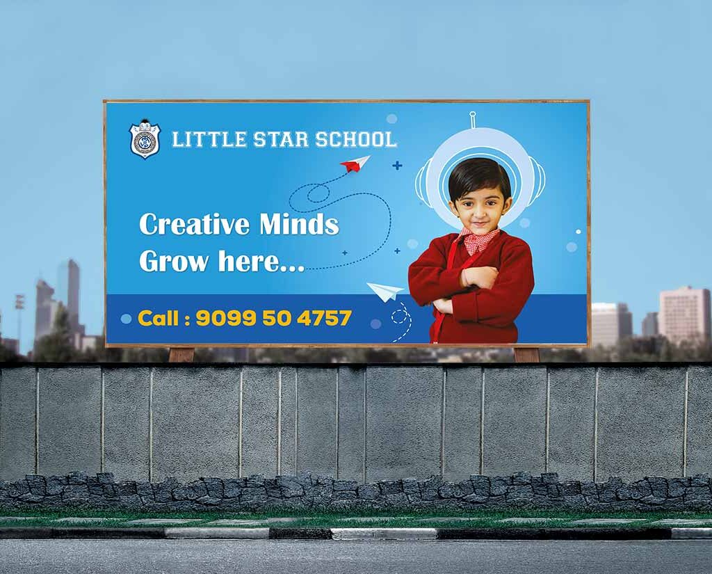
In the ever-evolving landscape of graphic design, the fusion of education and artistic expression has given rise to a captivating niche – School Hoarding Design or poster Design. This amalgamation of creativity and institutional representation brings forth a plethora of possibilities. Whether you’re a graphic designer seeking inspiration or an educator looking to spruce up your school’s ambiance, this article is your comprehensive guide to hoardings, designs, and the fascinating intersection of the two.

What are the key design elements in school hoarding?

School hoarding may seem like a simple advertising tool, but it’s a great opportunity to showcase a school’s core values and mission. The key design elements in school hoarding include not only eye-catching graphics and colors but also coherent messaging and branding on social media. Each school is unique, so it’s essential to tailor the design to the specific institution. That said, some common elements include the school’s logo, tagline, and educational offerings. While the ultimate goal is to attract prospective students, the design should also resonate with current students, faculty, and staff. By incorporating these key design elements, school hoarding can become an effective marketing tool that promotes the school’s identity and culture.

How does graphic design play a role in creating an impactful hoarding?

Graphic design is a crucial element when it comes to creating impactful hoardings. After all, hoardings serve as a representation of your brand, and your graphics need to be on point to grab the attention of your audience. Good design can make your message stand out and make it easier for people to understand what you’re trying to convey. A professionally designed hoarding will help increase brand recognition, boost sales, and leave a lasting impression on potential customers. Plus, the right design can generate buzz and get people talking about your business. So, the next time you’re planning a hoarding campaign, make sure you invest in good graphic design. It might just be the key to success!

Graphic Design for Educational Impact: Beyond Aesthetics

Graphic design is more than just making things look appealing. When it comes to education, effective graphic design can have a significant impact on the overall learning experience. Through the use of captivating visuals, carefully chosen typography, and thoughtful layouts, designers can help convey complex information in an easily digestible way. This not only makes learning more accessible but can also increase engagement and retention of information. The goal of educational design is to create a visually appealing and practical tool that can enhance the learning environment, and with the right design choices, the possibilities for impact are endless.

Visual Storytelling: Using Photos and PSDs in School Hoarding Design

Visual storytelling is an incredible way to connect with an audience in the digital world. By using a combination of photos and PSDs, you can create an eye-catching design that tells a story. And what better way to showcase this technique than on school hoardings? These large designs are perfect for grabbing the attention of students, faculty, and parents alike. So why not infuse some personality into your school’s hoardings and use visual storytelling to make a lasting impression? By incorporating creative and unique designs, you can create a space that feels welcoming and engaging for everyone who passes through your campus. Get ready to witness the power of visual storytelling, and watch as your school hoardings come to life.

How can photographs be incorporated into school hoarding designs?

Photos give us a glimpse into the past, capturing moments that we can look back upon for years to come. So why not use these snapshots of life to enhance school hoarding designs? By incorporating photographs into these designs, we can create a more engaging and dynamic environment for students and visitors alike. Whether it’s pictures of campus events, alumni achievements, or even just beautiful shots of the surrounding area, these images can add a touch of personality to the school’s branding. Plus, they serve as a reminder to everyone who passes by that this is a place where memories are made and that every student has a unique story to tell. So, next time you’re designing a school hoarding, think about how you can use photographs to add a personal touch.

Where can one find a diverse collection of photos and PSDs for school hoarding design?

Look no further than AdVoice.Inc! As a leading branding design company, we offer a diverse collection of photos and PSDs that will make your school hoarding banner stand out. From vibrant images to sleek designs, we have everything you need to create a unique and eye-catching display. Plus, our friendly team is always here to assist you in selecting the perfect elements for your project. Trust AdVoice.Inc. to elevate your school hoarding design to the next level!

Clarity in Design: The Role of Clipart in School Hoarding

When it comes to creating school hoardings that are visually appealing, it’s important to consider the role of clipart. Clipart may seem like an outdated art form, but when used effectively, it can make a big impact on the clarity of your design. By incorporating relevant and colorful clipart into your hoardings, you can help draw attention to important information and make it easier for students to understand. Plus, using clipart can add a touch of personality and creativity to an otherwise dry or mundane message. So next time you’re tasked with creating a school hoarding, don’t overlook the power of clipart – it could be just what you need to make your message stand out!

Conclusion:

Encouraging creativity in learning and taking notes is a great way to ensure students are making the most of their education. Put simply, school hoarding is an effective and enjoyable way to become a more creative student. So get organized, be creative, have fun and reap the rewards! Don’t forget to check out our website for tips and tricks on how to make your own unique school hoarding designs. To create your own awesome school hoarding design today, sign up for our free online course! It will help you unleash your inner creative genius and turn that knowledge into something meaningful!

School hoarding design refers to the graphical content created for advertising and promotion of schools. It includes designs like vectors, templates, and images that can be used for marketing and promotional purposes.

You can find free vector downloads for school hoarding design on various platforms such as Pinterest, where designers and agencies share their creations for free use.

Yes, there are numerous templates available for school hoarding design. These templates are designed to make the advertising process easier and more efficient.

You can get free PSD files for school hoarding design by exploring websites that offer free graphic resources. Many designers and agencies provide free PSD files for promotional and marketing materials.

Yes, there is a stock of free vector images available for school hoarding design. These images are usually royalty-free and can be used for various promotional activities.

Yes, most of the graphics available for school hoarding design are free to use for commercial purposes. However, it’s essential to review the licensing terms for each graphic to ensure proper usage.

You can explore high-quality graphics for school advertising by browsing through platforms that specialize in providing promotional materials. Additionally, you can connect with design agencies that offer such services.

You can find promotional graphics suitable for a preschool setting on various online platforms that cater to educational marketing materials. These graphics are designed to appeal to a younger audience and promote educational endeavors.

Yes, there are plenty of kid-friendly vector graphics available for school advertising. These graphics are tailored to engage with children and convey educational messages effectively.

You can incorporate natural and safe themes into school hoarding design by using imagery that depicts natural elements, outdoor activities, and safety measures. It’s essential to create a positive and secure environment through visual content.

School Hoarding Design
Packaging Design Companies

The Art of Packaging Design: Unveiling the Trends and Top Companies in India

Introduction

In a world where visual appeal plays a crucial role in consumer decisions, packaging design stands as a silent influencer. This blog post delves into the intricate world of packaging design, exploring the trends that captivate audiences and the top companies in India that excel in this creative domain.

Packaging Design Companies: 

Crafting Visual Masterpieces Packaging design companies play a pivotal role in shaping a brand’s identity. Let’s explore the essence of these creative hubs and understand why their expertise is indispensable in today’s market.

The Evolution of Design

Delve into the history of design, from traditional approaches to the modern trends that shape the industry today. Uncover how design has evolved to become a crucial element in brand strategy.

Top Packaging Design and branding companies  Companies in India

Discover the leading product packaging design companies in India and the unique flair they bring to the industry. From innovative solutions to impactful branding, these companies are setting new standards.

The Power of Graphic Design

Explore the intersection of graphic design and packaging. Understand how graphic elements contribute to brand identity and consumer perception, making products stand out on the shelves.

Design Trends in 2024

Stay ahead of the curve by exploring the latest design trends in 2023. From bold colors to minimalist approaches, understand what’s making waves in the dynamic world of packaging design.

The Role of Packaging in Branding

Unravel the connection between packaging and branding. Learn how a well-designed package can communicate a brand’s values and create a lasting impression on consumers.

Packaging Design Agency Rankings

Get insights into the rankings of packaging design agencies, including the latest trends shaping their approaches. Understand the criteria behind the rankings and how agencies strive for excellence.

Exploring the Creative Process

Step into the shoes of a designer as we dissect the creative process behind packaging design. From concept development to the final product, understand the steps that lead to visually stunning packages.

Beyond Aesthetics: Functionality Matters

While aesthetics are crucial, functionality cannot be overlooked. Explore how packaging design balances beauty with practicality, ensuring a seamless user experience.

The Impact of Packaging on Consumer Behavior

Dive into the psychology of consumer behavior and how packaging design influences purchasing decisions. Understand the subtle cues that sway choices on the crowded shelves.

Building a Brand Identity Through Design

Explore case studies of successful brands that have built a strong identity through packaging design. Understand the strategies they employed and the impact on their market positioning.

The Digital Frontier: Web Design and Packaging

In an era dominated by online shopping, the relationship between web design and packaging is crucial. Explore how brands ensure a cohesive visual experience across digital and physical realms.

Expertise Beyond Branding Design: Digital Marketing and SEO

Discover how packaging design companies leverage digital marketing and SEO strategies to enhance their reach. Explore the importance of online visibility in an interconnected world.

 The Future of Packaging Innovation

Peek into the crystal ball of packaging design and explore the future innovations that await. From sustainability to interactive packaging, understand the trends shaping the industry’s tomorrow.

 Craftsmanship in Packaging Design

Appreciate the artistry involved in packaging design. From intricate details to creative solutions, discover how designers craft packages that are not just containers but pieces of art.

Best Packaging Design Company

When it comes to the best packaging design Service in Ahmedabad, Advoice Inc. is the leader in design solutions and visual communication. The company specializes in providing innovative and eye-catching packaging, branding designs, and website designs that help our clients stand out in the market. 

The team at Advoice Inc. is known for our creativity, attention to detail, and ability to understand and cater to the specific needs of each client. With a focus on creating unique and creative designs, Advoice Inc. has earned a reputation for being the go-to firm for businesses looking to elevate their packaging and branding. 

Our dedication to quality and customer satisfaction sets them apart as the top choice for companies in Ahmedabad and beyond. We have experience graphic designer who help in brand development .

Conclusion

Packaging design is a blend of art, strategy, and functionality. As we conclude this journey through trends and top companies, one thing is clear – packaging design is a dynamic force that continues to redefine the visual language of brands.

The latest trends in packaging design include eco-friendly and sustainable materials, minimalist and clean designs, interactive and personalized packaging, and bold and vibrant colors.

The top packaging design companies in Ahmedabad include Designer People, Pkg Brand Design, and Designer People.

You can find the best packaging design company in India by researching online, browsing through company profiles on platforms like DesignRush, and reading client reviews and ratings.

When choosing a packaging design company, look for expertise in design services, feedback from previous clients, a portfolio of unique packaging designs, and a strategic approach to branding and marketing.

Top packaging design companies offer a range of services including packaging design, logo designlogo designing, illustration, explainer videos, brochure designbrochure designef=”https://www.advoice.co.in/social-media-marketing-strategy/”>social media marketing.

Yes, packaging design companies can help with brand marketing by creating visually appealing and memorable packaging that resonates with the target audience and supports overall brand messaging.

A top packaging design company stands out through its expertise in creating unique and impactful packaging designs, its understanding of the latest trends and consumer preferences, and its ability to deliver strategic and effective branding solutions.

Yes, there are design companies in Ahmedabad that specialize in digital marketing and offer services such as social media marketing, PPC advertising, and branding through digital platforms.

A boutique packaging design company is known for its personalized and attentive approach, often catering to niche markets or specific industries, and delivering high-quality, specialized design services.

The Dec 2023 rankings for packaging design companies in India can be found on platforms like Advoice Inc where companies are listed and evaluated based on their expertise and client feedback.

Packaging Design Companies
Namkeen Logo Design

Crafting Delicious Identities: A Comprehensive Guide To Make Namkeen Snack Logo Design

Introduction

Namkeen Snack Logos: A Feast for the Eyes

Are you launching a snack-based business and craving the perfect logo to represent your brand? Look no further! This article is your go-to guide for snack logo design, offering insights, inspiration, and practical tips. We’ll explore the world of creating a custom snack logo, using free resources and leveraging online tools to make your brand stand out. Whether you’re a startup or an established company, a captivating logo is the secret sauce to leaving a lasting impression on your audience.

Making the Crave-Worthy: The Art of Namkeen Snack Logo Design Ideas

What elements make a good snack logo?

When it comes to snack logos, the design plays a crucial role in capturing the attention of potential customers. A well-designed Namkeen logo should catch the eye and make a lasting impression. One of the essential elements of a good snack logo is simplicity. The fewer elements a logo has, the more effective it can be in conveying the brand’s message. Additionally, a good snack logo design should be memorable, unique, and reflective of the brand’s personality. An effective Namkeen logo should have a color scheme that is relevant to the product and easily recognizable. With these crucial elements in mind, a well-designed snack logo can make a lasting impact on customers and help a brand stand out in a crowded market.

How can you create a snack logo that resonates with your audience?

When it comes to creating a successful snack logo, it’s all about understanding your audience and catering to their tastes. Whether you’re designing a Namkeen logo or something else entirely, you’ll want to put yourself in your customers’ shoes and think about what qualities they associate with a satisfying snack. This might mean incorporating bold colors and playful designs or focusing on traditional ingredients and flavors. By tapping into the preferences of your target audience, you can create a logo that resonates with them and makes your snack brand stand out in a crowded market.

Exploring the world of online logo design tools.

In the world of branding, first impressions are key and a well-designed logo can make all the difference. However, not everyone has the resources or know-how to hire a professional designer. That’s where online logo design tools come in. With the rise of e-commerce, many companies have created user-friendly platforms that allow individuals to create stunning logos at a fraction of the cost. This is particularly useful for small or local businesses that need a tailored logo that reflects their brand. One such example is the Namkeen logo design where individuals can add a personal touch to their snack business with a visually appealing logo. Exploring the world of online logo design tools is not only cost-effective, but it also puts the power of branding in the hands of the people.

How do you generate creative ideas for your snack logo?

Designing a logo for a Namkeen snack can be challenging, but with creativity and inspiration, it can also be incredibly exciting. One of the best ways to generate original ideas is to start with brainstorming. Think about the values you want your logo to represent. Do you want it to be playful, nostalgic, or modern? Look at other popular snack logos to get an idea of what works and what doesn’t. Encourage yourself to think outside the box, and try to spark new ideas with colors, typography, and imagery. Don’t be afraid to experiment and push boundaries; after all, a great Namkeen logo can make all the difference.

The Role of Color in Snack Logo Design

Color plays a crucial role in snack logo design as it has a significant impact on consumer perception in the snack industry. The right color palette can evoke specific emotions and associations, influencing how consumers perceive the taste and freshness of a snack. For instance, warm, inviting tones such as red and orange can convey a sense of energy and excitement, while cooler shades like blue and green might suggest a feeling of refreshment and health. By understanding the psychology behind color, snack companies can effectively use it to convey the desired message and make their product more appealing to their target audience.

Shapes and Flavors: Crafting the Perfect Snack Logo

When it comes to crafting the perfect snack logo, the significance of shapes in logo design cannot be overstated. The shape of your logo can convey a lot about your brand identity and the type of snacks you offer. It’s important to align your logo’s shape with your snack business identity, whether that’s through using soft and round shapes for a friendly and inviting vibe, or sharp and angular shapes for a more bold and edgy feel. Additionally, using iconic shapes can help create a memorable and recognizable logo that will stick in consumers’ minds and stand out among competitors.

Fonts that Pop: Typography in Snack Logo Design

When it comes to snack logo design, selecting the right font is crucial for making a strong impression. Typography plays a key role in conveying the personality of your brand, so it’s important to match the font style with the overall image you want to project. Whether you’re aiming for a fun and playful look or a more sophisticated and elegant feel, the right font can make all the difference. Additionally, creating a harmonious balance between text and design elements is essential for an eye-catching logo. By carefully choosing the right font, you can ensure that your snack logo stands out and effectively communicates the essence of your brand.

Brand Identity: Customizing Snack Logos for Your Business

 A custom snack logo is crucial for brand recognition because it helps distinguish your product from competitors on crowded shelves. To infuse your brand’s unique personality into the logo, consider using colors, fonts, and imagery that align with your brand’s identity. Balancing creativity with a consistent brand message is key to creating a memorable logo that resonates with consumers. By customizing your snack logo, you can communicate the essence of your brand to potential customers and create a lasting impression that sets you apart in the marketplace.

Making the Crave-Worthy: The Art of Snack Logo Design

When diving into the world of snack logo design, it’s crucial to understand the elements that make a logo not just visually appealing but also reflective of your brand identity. A good snack logo should be simple, memorable, and versatile. Simplicity ensures that your logo is easily recognizable, even in smaller sizes or on packaging. Memorable logos leave a lasting impression, increasing brand recall. Versatility ensures that your logo looks great across various platforms, from digital to print.

Best Branding Design Agency in Ahmedabad

In the bustling city of Ahmedabad, AdVoice.Inc stands tall as the leading branding design agency. With an impressive portfolio and a team of skilled professionals, this branding design company has earned a reputation for creating top-notch branding solutions that help businesses stand out from the crowd. Every branding project is approached with creativity and a keen eye for detail, ensuring that the result does justice to the client’s business objectives. AdVoice.Inc’s ability to seamlessly blend design aesthetics with marketing strategy makes it a highly sought-after agency in Ahmedabad, and its commitment to quality has won the trust of several clients. For those looking to make a mark in their industry, partnering with AdVoice.Inc. should be the first step towards comprehensive branding success.

Conclusion

Creating your logo is an exciting journey. It starts with understanding your brand values and the message you want to convey. Do you want your snack logo to reflect a sense of playfulness, healthiness, or indulgence? Use these answers as a foundation for your design. Next, leverage online logo design tools that offer user-friendly interfaces and a plethora of design elements.

A unique logo helps in creating brand identity, setting you apart from competitors, and making a lasting impression on your clientele.

A real estate logo editor provides the flexibility to tailor the logo to suit the specific vision and skill of the real estate business, ensuring a better fit for the brand identity.

Real estate logos often feature symbols of property, such as houses or buildings, to convey the focus on residential and commercial properties.

A successful real estate business operates in both the residential and commercial sectors, and the logo should reflect the balance and success in catering to both areas.

A well-designed logo can make a solid impact on the target audience, conveying professionalism, trust, and reliability, ultimately contributing to the growth of the business.

Including text in a real estate logo can provide a better balance and make it more impactful, especially for signage and branding purposes.

Fonts that are sans-serif, solid, and exude professionalism are often preferred for real estate logos, as they better fit the overall brand image.

The color selection in a real estate logo should convey trust, stability, and reliability, making it more appealing to potential clients and customers.

When selecting a real estate logo design company, consider their portfolio, experience in the industry, and ability to understand and fulfill the specific vision of your business.

The cost of creating a unique real estate logo design varies based on the complexity of the design, the skill of the designer, and the overall package offered by the design company.